MyABL APP UI
ABL Banking App
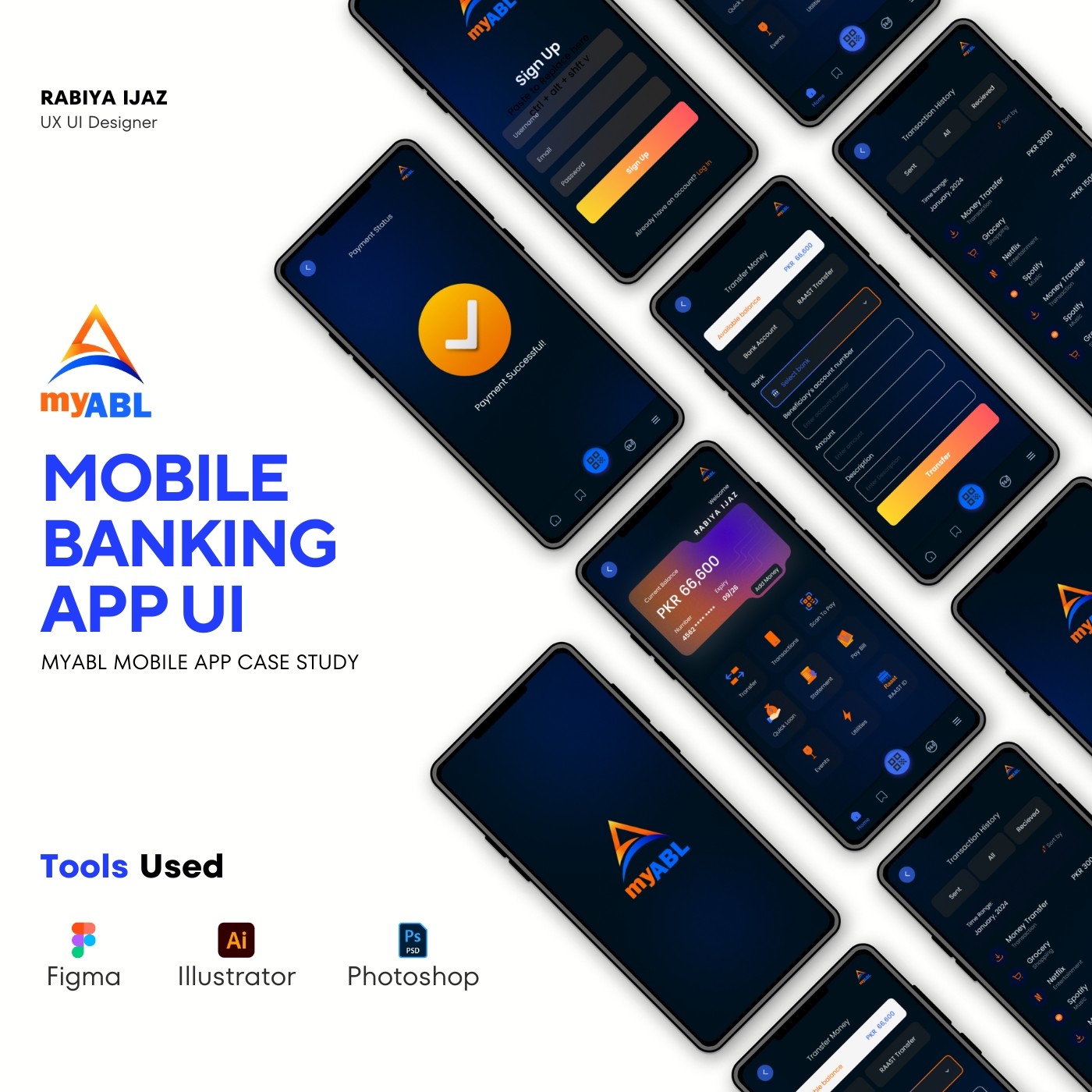
Challenge
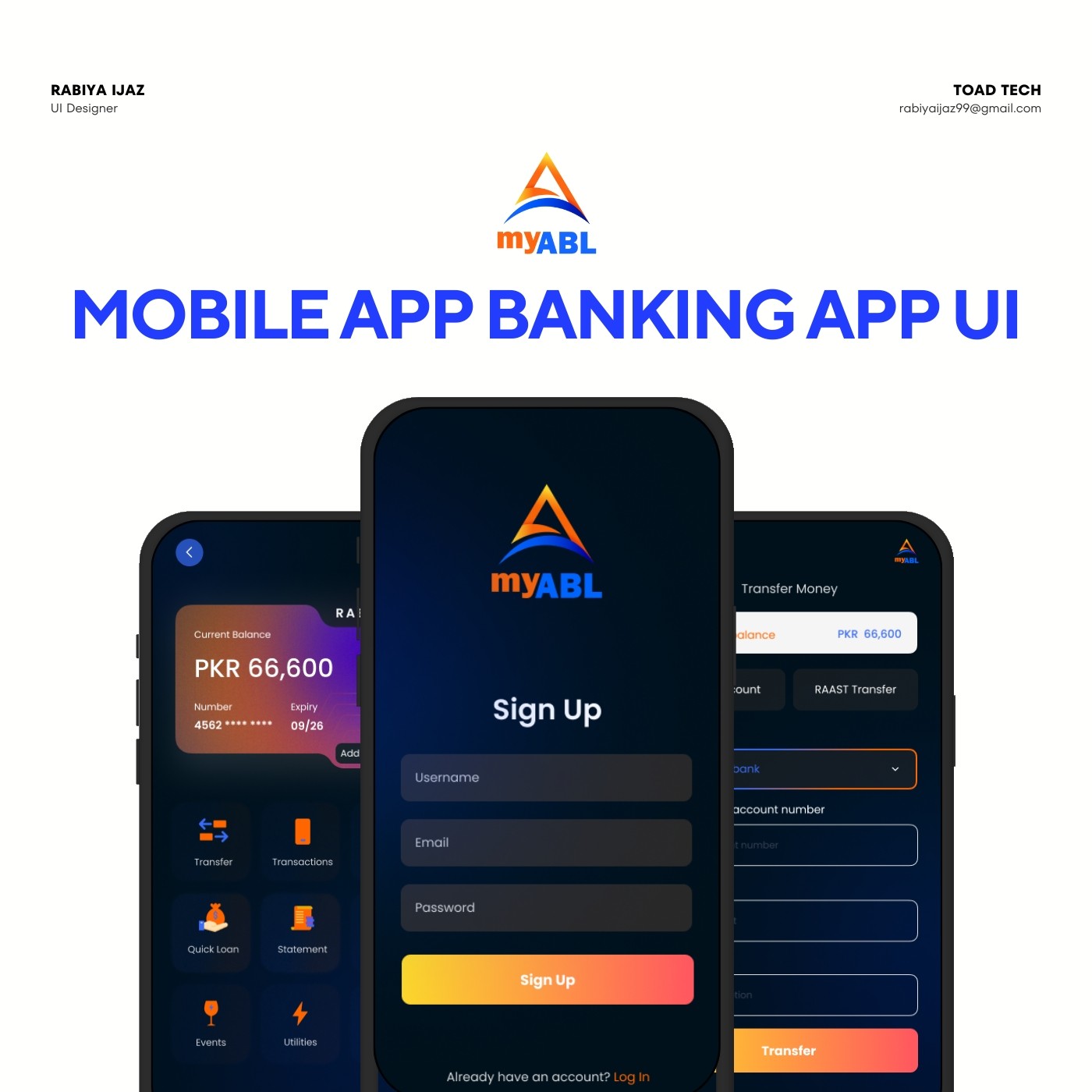
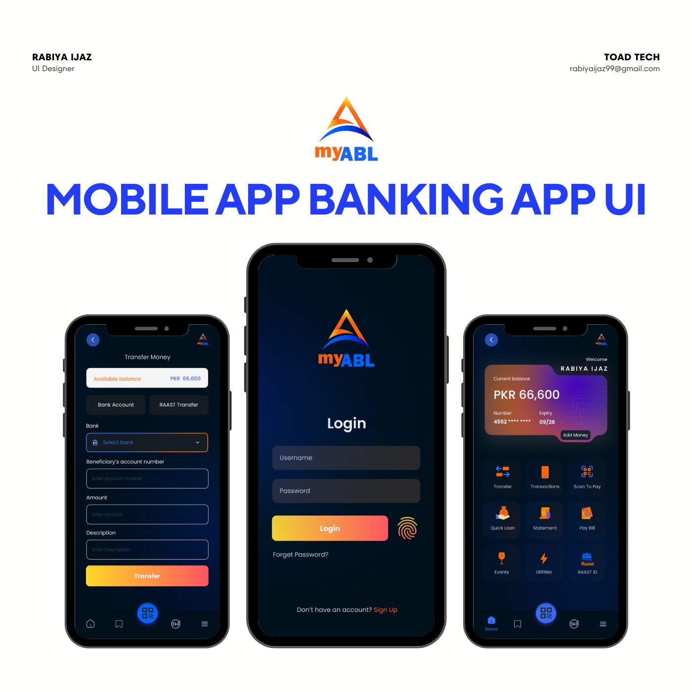
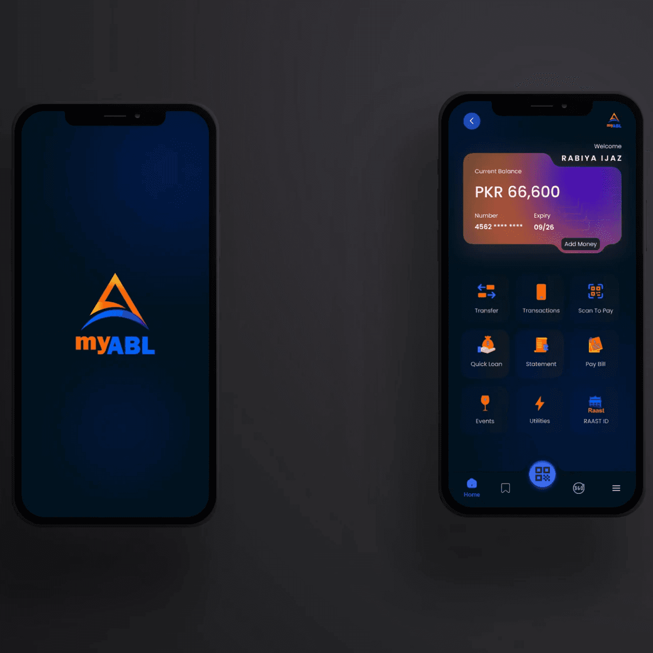
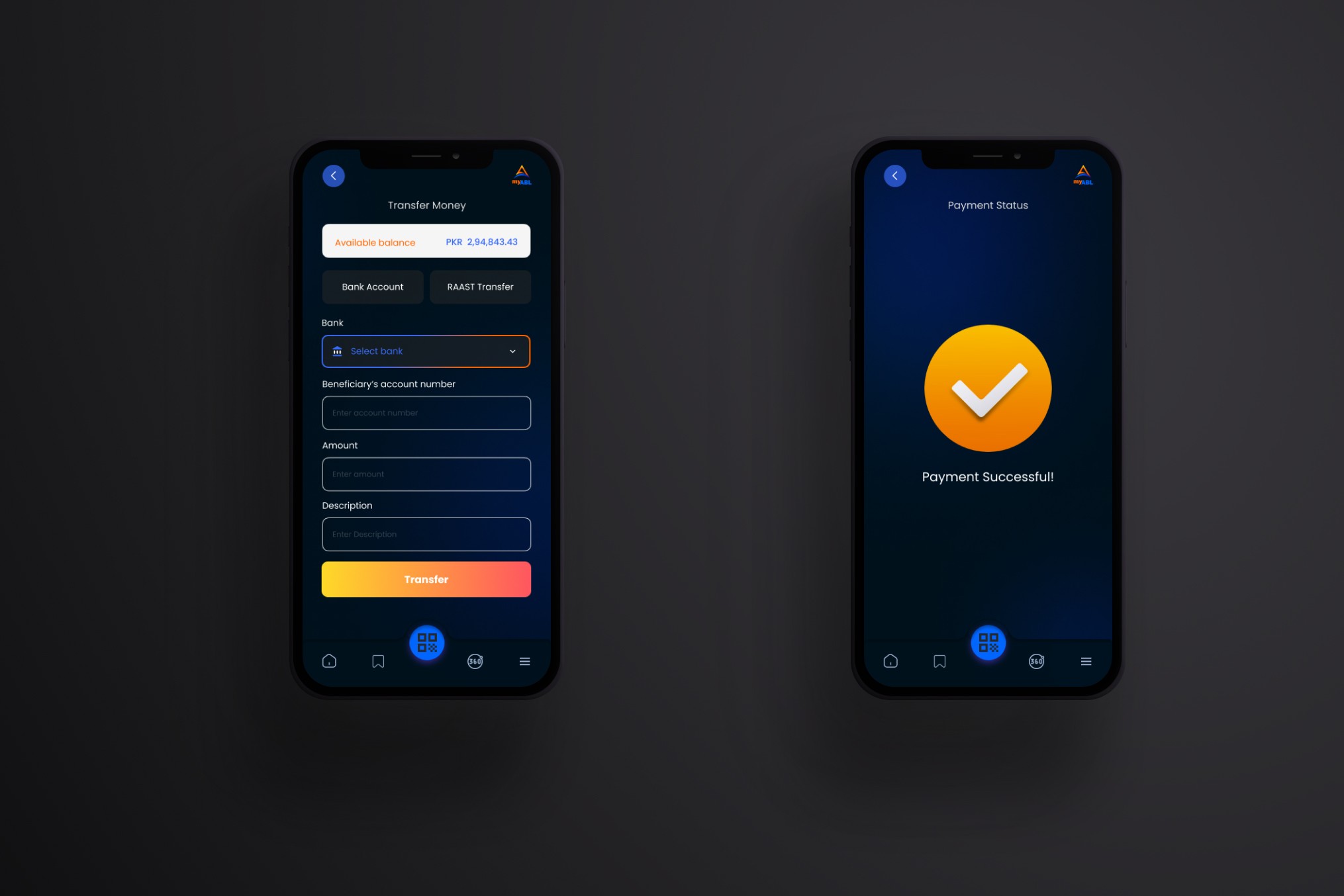
The Abl Banking App’s existing user interface lacked a dark mode option, causing discomfort for users who preferred or needed a darker theme for better readability, especially in low-light environments. This lack of accessibility impacted user experience, leading to potential eye strain and reduced app usage.
Goal
The goal was to design a dark mode interface for the ABL Banking App that would enhance user comfort and readability without sacrificing usability or aesthetic quality. The dark mode needed to provide a visually appealing and accessible experience for all users.
Solution
A dark mode UI was developed for the ABL Banking App, featuring high-contrast color schemes and accessible text sizes to ensure readability in dim environments. The design also incorporated clear icons and a well-structured visual hierarchy, maintaining ease of navigation and a consistent user experience across different lighting conditions.